Aaron Seward reports for The Architect’s Newspaper: In Detail> 19 East Houston Street
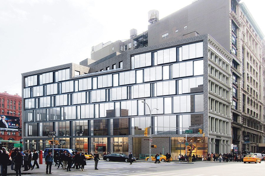
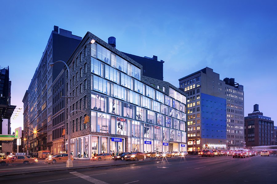
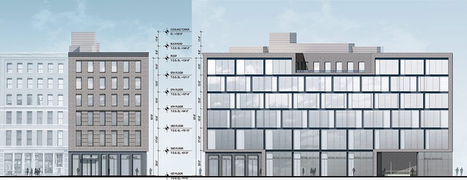
The new building mimics the scale of its neighbor and its Houston Street face is meant to appear as though it has been sliced away, revealing the section.
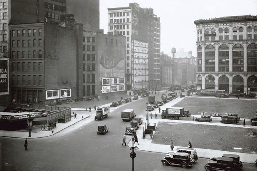
Up through the 1920s, Houston Street was a narrow little passageway through the lower Manhattan trenches, no bigger than Spring Street is today. It was not until the 1930s, as part of Robert Moses’ overhaul and modernization of New York City, that it took on its current form as a multi-lane thoroughfare. The transformation from urban lane to city highway involved the demolition of quite a few buildings, and resulted in a number of odd-shaped and sliver-like lots that would only appeal to a developer in the city’s current real estate reality.
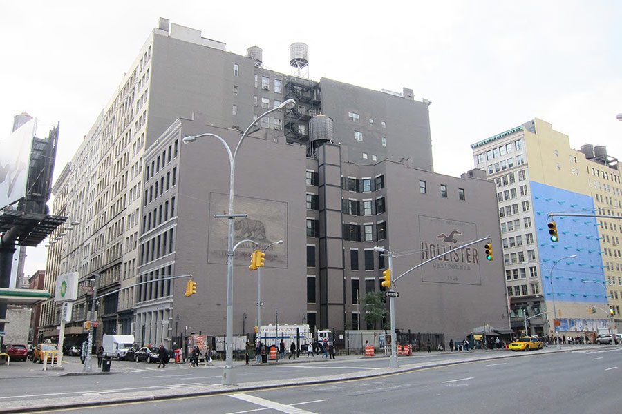
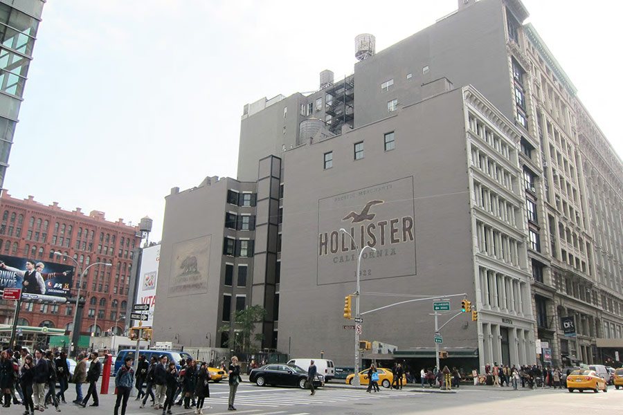
One such oddity is a triangular plot on the south curb of Houston bordered by Broadway and Crosby Street—a prominent location that for years has been home to a fruit stand, a subway entrance, and an MTA parking lot. The brick wall of the building bordering the lot has been used as a billboard for much of this time, home for an age to an iconic DKNY advertisement, and now branded with the logo of the Southern Californian clothing company Hollister and an artificially distressed rendition of the California state flag.
 |
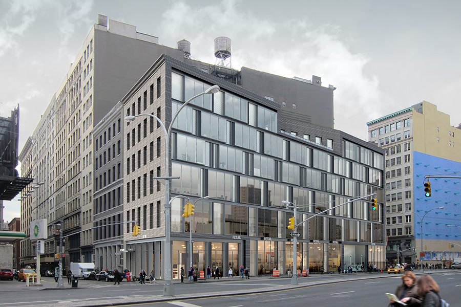 |
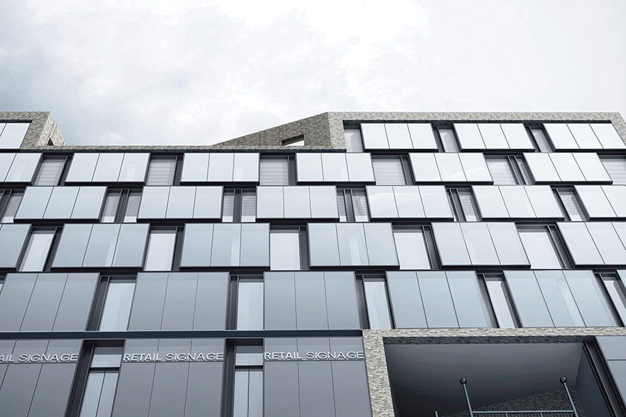
The façade system’s depth and variation are inspired by Soho’s historic cast iron façades.
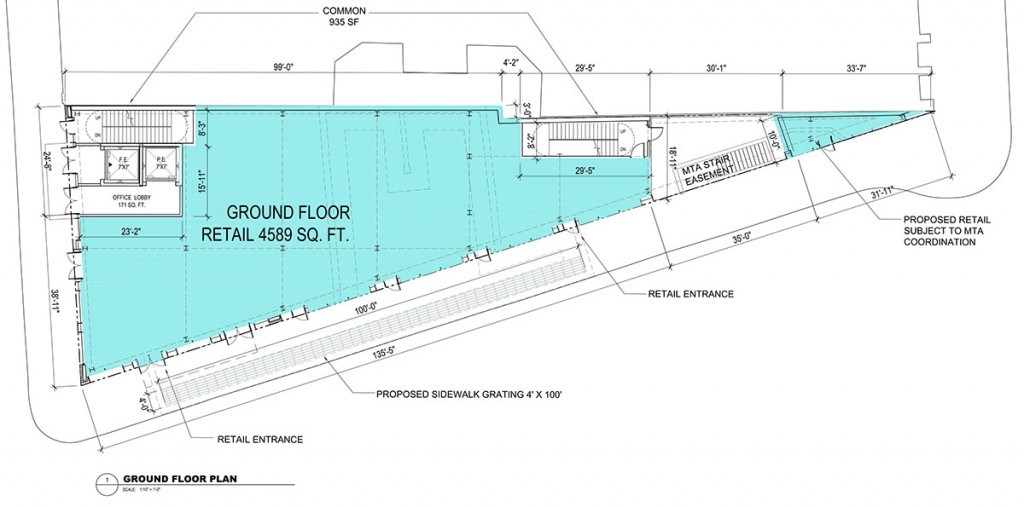
This awkward patch of land is now being developed by New York City–based real estate investment and operating company Madison Capital. It will soon be home to a building comprising four floors of retail (one subterranean) and three floors of office space. With a 36-foot exposure on Crosby Street, a little over 200 feet on Houston, and nothing but a razor’s edge on Broadway, the building will offer about 5,000 square feet of leasable space per floor, considering vertical circulation needs and an MTA easement for the subway entrance.
This relatively limited amount of space was not seen as an impediment to finding likely tenants. In the words of Perkins Eastman principal Navid Maqami, “The value of the property is not so much in the floor plans and square footage—it’s the location more than anything else. It’s about visibility and who would want to be there.”
The building’s glass façade will glow at night along Houston Street.
Since the site sits at the edge of the Soho Cast Iron Historic District, the design of the building had to pass muster with the Landmarks Preservation Commission. Perkins Eastman took a contextual/contemporary approach to this challenge. The structure’s massing and floor-to-floor heights match that of its immediate neighbor, keeping it on-scale with the area. The treatment of the Crosby façade is the most contextual. It is clad with a Danish grey brick that closely matches the material facing other buildings on that street (Denmark was apparently the closest place to source a natural brick of that particular color) and also features punched windows and even a cornice.
 |
 |
 |
The Houston façade, on the other hand, is a contemporary interpretation of the 19th-century cast iron facades that predominate in Soho. Here, the architectural notion is that a pre-existing building has been sliced by the widening of the street, leaving a sectional view of the structure. In addition to communicating this idea, Maqami and his design team played on the strong horizontal character of the historic district’s facades, their layering and depth, and their variation and elaboration from floor to floor.
To emulate these features in a contemporary idiom, the team employed two layers of floor-to-ceiling glass—one set 18 inches inboard from the other—aluminum pilasters, and a frame of the Danish grey brick that carries over from the Crosby Street face. The outboard panels of glass are all 15 feet wide, while the inboard panels vary in width from 1 foot 6 inches to 7 feet 2 inches. The architects change up where these varying-width panels fall, thus modulating the expression up the elevation and creating a sense of movement along high-speed Houston Street.
The building’s first three floors, which are all dedicated to retail, are faced with transparent glass panels. This changes in the top three office floors, on which the inboard glass panels are treated with an increasingly opaque ceramic frit pattern. On the fourth floor the inboard panels feature 33 percent frit, on the fifth floor they feature 66 percent frit, and on the sixth and top floor they feature 100 percent frit, thus providing a higher and higher degree of privacy as you go up the elevation.
For those of you wondering what will be done with the thin-edge-of-the-wedge space at the corner of Broadway, it will be left empty, a soaring atrium from the second floor up, giving whatever retail tenant that takes the space a highly visible branding opportunity. Whatever piece of advertising fills this space, it will show through the glass façade to the bustling throng entering Soho from the Village—a preservation of the building-as-billboard condition that has ruled this site for the past few generations.

